SpaRitual’s Enhanced Body Care Packaging Emphasizes Self-Care Rituals And Clean Ingredients
Championing body care as a segment that shouldn’t be relegated to second-class status in the beauty industry, SpaRitual is unveiling a packaging upgrade putting its body care products on par with facial care.
The brand’s redesign recognizes the burgeoning role of body care in its portfolio as well as the evolution of the broader clean beauty market in which ingredients are being placed under the microscope across the merchandise spectrum. The first nail polish purveyor committed to vegan formulas when it started 15 years ago, half of SpaRitual’s business is now fueled by natural body care products. Last year, its body care revenues climbed 10% and, with the refresh, the brand projects they’ll leap 30% this year.
“We are known as a nail color brand, but our sales are showing there is a lot of interest in the body care category. We’re growing in the category and saw that there’s a ton of potential there, so we’ve been putting more attention and effort in promoting the body care services and products we provide,” says SpaRitual founder Shel Pink. “We are looking at the body care category outpacing our nail care category. We are seeing more retailers bringing in body care and elevating the category.”
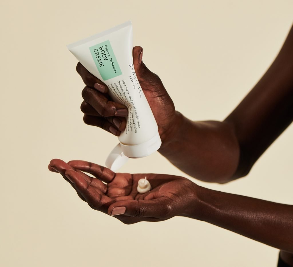
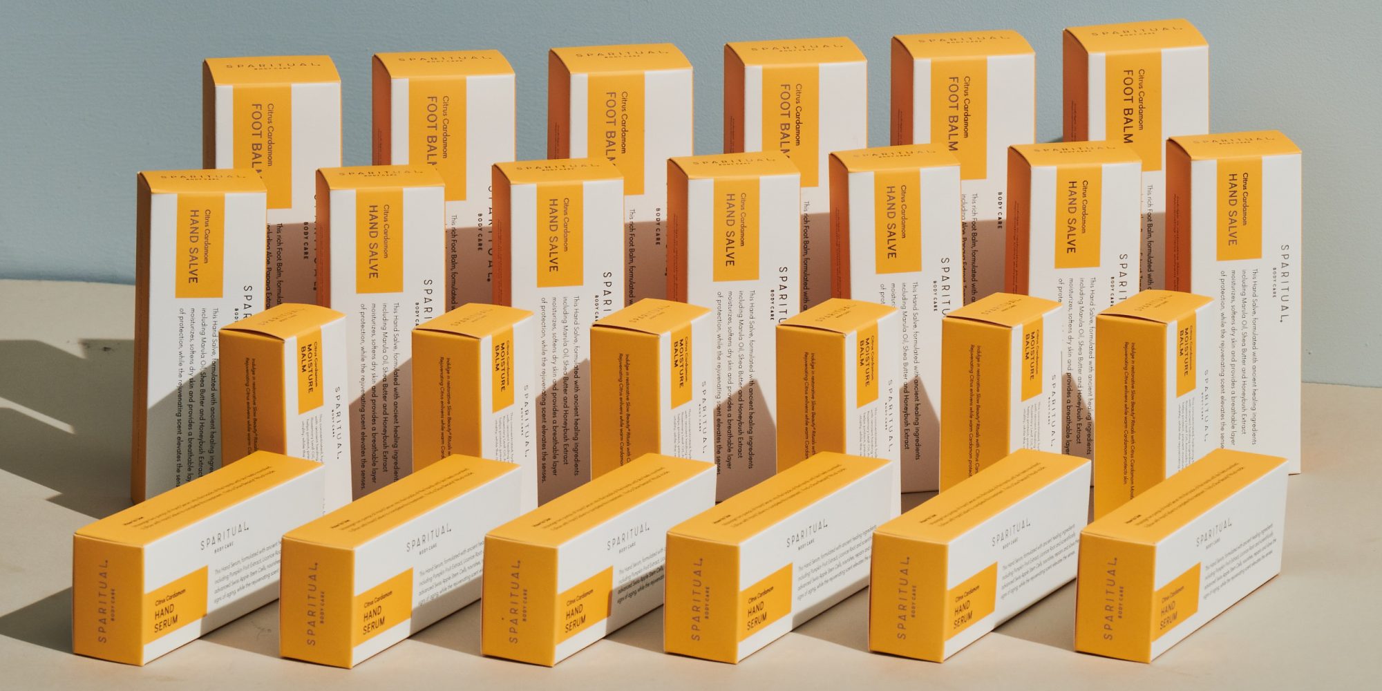
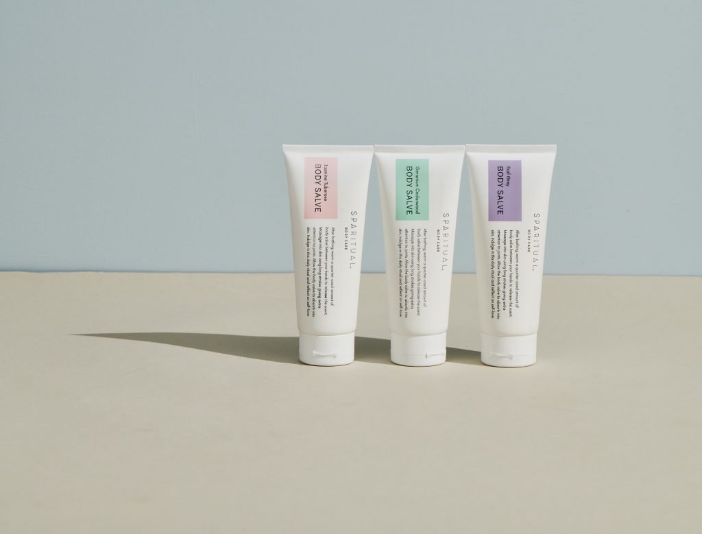
In its earliest incarnation, the brand’s body care packaging resembled its nail polish packaging with a white and plum palette, and it was heavy on information to convey the message of conscious consumerism. Later, SpaRitual moved away from the copious copy to streamline its body care presentation. Today, the brand has returned to sharing extensive information on the packaging, where self-care rituals and ingredients are highlighted on white encasements accented with orange for its citrus cardamom scent, green for its geranium cedarwood scent, pink for its jasmine tuberose scent, and purple for its earl gray scent.
“It’s going back to how we originally started in terms of the cleanliness, white packaging and communicating directly on the packaging about who we are as a brand. It’s very educational,” says Pink. “What’s happening now is that everyone is communicating strongly. People want to be educated about clean ingredients, and it’s important to communicate your different touch points.”
“We are looking at the body care category outpacing our nail care category. We are seeing more retailers bringing in body care and elevating the category.”
Over the course of two years revamping packaging, Pink scrutinized the fronts and backs of SpaRitual’s tubes and boxes to perfect details. On the tubes’ fronts, instructions for product use with an emphasis on the sensorial aspects of body care application are included. The sensorial aspects are integral to Pink’s slow beauty ethos. In 2017, she released the book, “Slow Beauty: Rituals and Recipes to Nourish the Body and Feed the Soul,” to outline the practice of creating meaningful moments amid people’s busy schedules. A shift in the logo evening the sizes of “spa” and “ritual” (spa previously was comparably more substantial) also heightens SpaRitual’s ritual component.
On the secondary packaging, the focus is on the ingredients. On back panels, they are spelled out in a bigger font than is customary for personal care ingredient decks to be clear and legible for consumers accustomed to flipping around packaging to read ingredient lists. Specifics are doled out about the percentages of certified organic and naturally-derived ingredients, and the recyclable content of the packaging.

“The panel is very important because that’s what people are really looking at to find out about transparency and the cleanliness of the formula,” says Pink. “For the primary package, we wanted to have the ritual right on there. That plays into the philosophy of taking time for yourself and slowing down. We didn’t want to people to have to hunt for that.”
Along with the aesthetics update, SpaRitual evaluated its body care assortment. Previously, the assortment went as high as 36 products, but it’s been whittled down to 15 products geared toward retail and 18 products for spa professionals. “I didn’t want to have so many options. I wanted to simplify it,” explains Pink, noting SpaRitual’s Body Salve, Hand Salve and Body Creme are bestsellers. The brand isn’t stopping launches. Next month, a hand serum is joining its lineup, and baby care products and tools are on the docket for future introductions.
“The body is a vitally important—skin is our largest organ—so it’s really crucial to be intentional about the ingredients you’re putting below your face.”
As it culled the assortment, SpaRitual improved the formulations of the remaining offerings. Pink mentions the percentage of organic ingredients in the formulas increased, and vitamin-rich coconut sugar replaced refined sugar for exfoliation. The enhanced formulas led to slightly loftier prices on select products. On the whole, SpaRitual’s body care prices rose roughly 10% to between $20 and $55.
In a body care category traditionally commodity-driven, Pink acknowledges convincing consumers to pay a premium for body care products is a challenge. However, with education from spas and stores, she believes they’ll understand why quality body care is a good choice. Pink says, “People are changing their cleaning products. They are changing their face products. The body is a vitally important—skin is our largest organ—so it’s really crucial to be intentional about the ingredients you’re putting below your face.”
Owned by nail lacquer specialist Orly, SpaRitual’s heritage is in the spa channel, and it’s dedicated to going deeper in that channel. The brand is out to boost its role in spa services. Outside of spas, SpaRitual would like to escalate direct-to-consumer sales and expand its distribution at clean beauty retailers. It’s already carried by The Detox Market.
No matter the store or spa location, Pink feels SpaRitual’s new packaging will draw shoppers to its body care. “We definitely wanted it to be eye-catching, and something that people, when it’s sitting on the shelf, would engage with. You want to learn more about the brand,” she says. “When you go over to it, you’re turning it on the side to read it, and there’s a real interactivity with the packaging. It feels nice in the hand, too. All of that was really intentional.”


Leave a Reply
You must be logged in to post a comment.