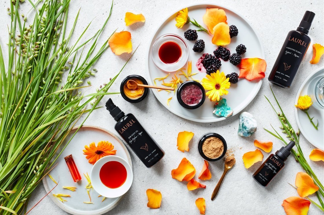
Laurel Whole Plant Organics Upgrades Its Packaging To Suit Upscale Distribution Partners
Laurel Whole Plant Organics has incredibly close relationships with its spa partners. Every 18 months, it invites aestheticians from them to a lengthy educational and self-care retreat. For Miraval resorts, the skincare brand creates signature products and services centered upon ingredients grown on its properties and surrounding farms.
Not surprisingly, when it received feedback from spa accounts that its design wasn’t up to snuff, Laurel decided to listen carefully and respond. After a three-year process, the brand has unveiled a revamp raising the sophistication of its look with screen printing, the option of secondary packaging and a new heart-shaped leaf logo.
“I just knew that we had to make it more upscale to be better suited to the spas we wanted to work with,” says Laurel Shaffer, founder of Laurel. “I’ve always wanted to work with spas because I have a real passion for plant medicine, and I have a real passion for skin health and rituals, and all of those things come together in spa treatments.”
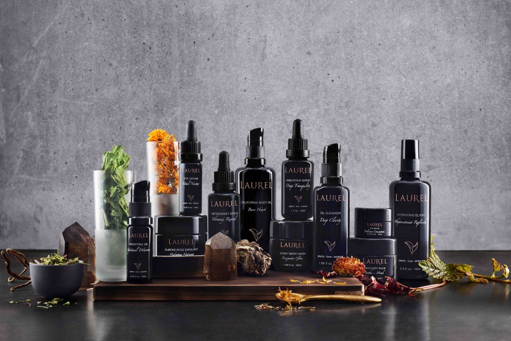
Developed in collaboration with Figmint Design and Oyl + Water, Laurel’s upgraded packaging features foiled and press-printed boxes handmade by American artisans, Miron glass bottles and flower graphics signifying the importance of what’s inside the bottles. Laurel’s assortment with nearly 30 stockkeeping units priced from $24 to $106 incorporates over 150 plants. Stockists can decide whether to pick up the products with or without boxes.
“We really considered the details of the packaging. From the ink we chose to the flowers, we made mindful decisions,” says Shaffer. “It took us 20 tries to get the ink right on the boxes for shade and legibility. The flowers on the sides of the boxes are hard to identify, which is what I liked about them. Our line is a plant medicine line, and I don’t want to be associated with just one particular plant.”
“I’ve always wanted to work with spas because I have a real passion for plant medicine, and I have a real passion for skin health and rituals, and all of those things come together in spa treatments.”
Laurel’s design has evolved since the brand’s start as Sequoia Beauty prior to a makeover in 2014. Shaffer figures its original earthy packaging was appropriate for grocers, but didn’t fit the high-end spa segment. Then, with the rebranding introducing its current name, the packaging was heightened with luxury sensibilities that have been further elevated in Laurel’s latest iteration. The latest overhaul also brings updates to eight formulas and compliance with European Union regulations.
A constant throughout Laurel’s history is Trinette Reed, a photographer sumptuously capturing the brand’s seed-to-bottle ethos. In addition to Reed, Laurel has tapped prop stylist Laura Cook to assist in shaping the visual representation of the brand. Shaffer says, “I initially pushed back on the idea of a prop stylist, but it’s hugely helpful to not have all that creative weight on your shoulders alone as a brand owner.”
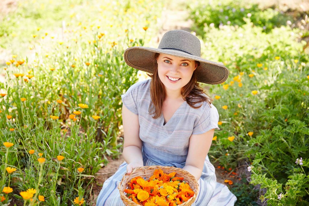
The path the ingredients travel before they enter Laurel’s packaging is central to the brand. Describing herself as a “sourcing activist,” Shaffer has painstakingly vetted around 40 farms, many of them within 100 miles of Laurel’s studio in Sausalito, Calif., where products are manufactured in-house, to supply the plant materials that become her brand’s formulas.
Eventually, Shaffer’s plan is for Laurel to have its own farm and vertically integrate its production. In the absence of its own farm, she says, “We put money back into our farms, and we really nurture the farms from the ground up to make sure we [sustain] our sourcing supply chain…I don’t think most formulators know where their ingredients come from. I have been to most of our farms and know our farmers.”
“We really considered the details of the packaging. From the ink we chose to the flowers, we made mindful decisions.”
Compared to ingredients in conventional skincare products, Shaffer estimates the domestically-cultivated organic ingredients in her brand’s formulas are five times the cost. She explains, “It is the organic domestic cultivation that makes them more expensive, which we do because we feel that is the responsible way to source ingredients and the very small way that we can make a difference in the health of our planet.”
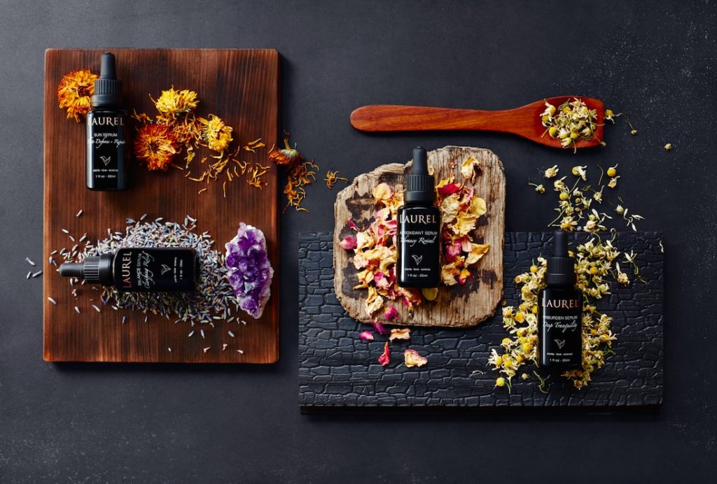
Despite the lofty costs of ingredients, Laurel doesn’t skimp on them in its formulations. Its Antioxidant Serum Vibrancy Renewal, the first product Shaffer crafted, has 31 active ingredients. Among the ingredients are rosehip, red raspberry, cranberry, pomegranate and evening primrose oils, rosemary and gotu kola extracts, and white rose, jasmine, frankincense, myrrh, sandalwood, elderberry, chamomile and yarrow. The jasmine is hydro-distilled, a rare distillation technique. The plants are macerated together for three months and, following the three months, they’re hand-pressed and turned into finished goods in small-batch production.
As its packaging was being renovated, Laurel put distribution expansion on hold. It has 125 wholesale partners, including Miraval, The Detox Market, Angela Peck Skin Wellness, Ventana, Multiversity 1440 and Studio Britta. With its packaging renovation behind it, Laurel is entertaining the possibility of enlarging its distribution network. Shaffer says the brand gravitates to spas and retailers with customers “who really care where their ingredients are coming from, and who are really looking for integrity, authenticity, love and heart in a product.”
Laurel’s sales have been increasing 30% annually, and Shaffer believes their growth will intensify with the packaging improvement. She says spas “told me to do it because they wanted me to do better. I hope this serves them well. And, for locations like The Detox Market, I hope it’s easier for them to sell our products now that they are in boxes.”
Leave a Reply
You must be logged in to post a comment.